US Jobs Lost due to the Coronavirus Pandemic
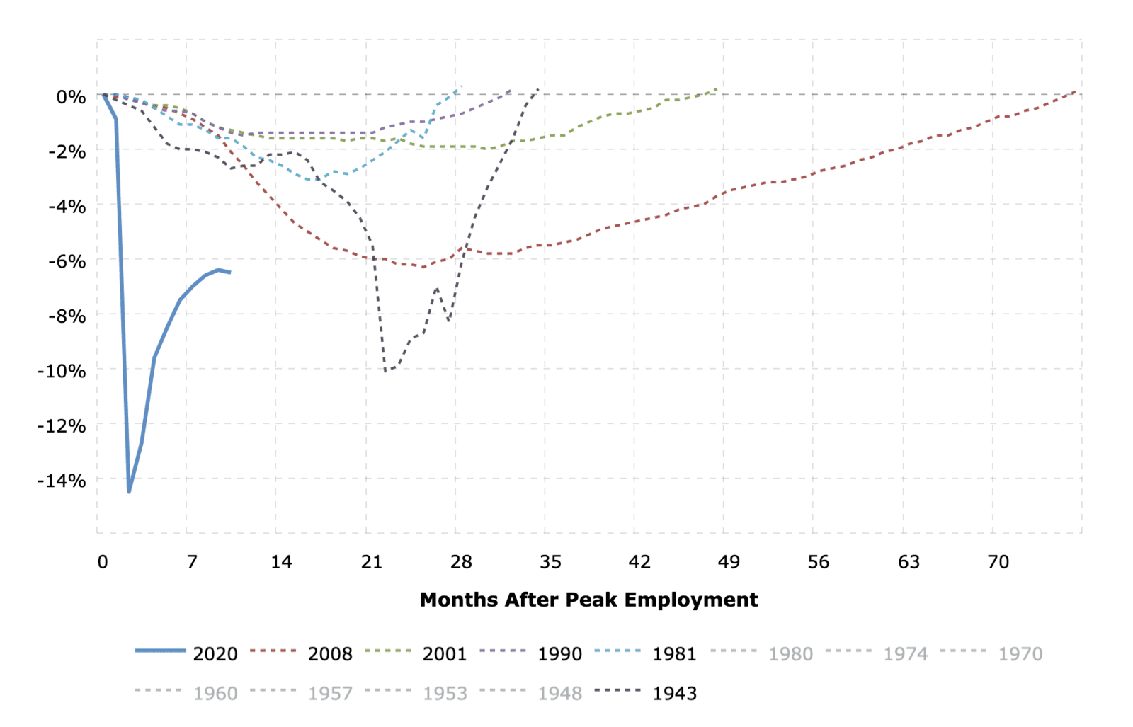
This useful MacroTrends chart helps you visualize the percentage loss in jobs from the previous peak for all recessions back to 1943. The y-axis shows the percentage change in the BLS non-farm payrolls number and the x-axis shows the number of months until the previous peak was reached again. The solid blue line shows the current percentage job losses in the U.S. due to the coronavirus pandemic.